


From a web designer’s perspective, creating a better and more usable form usually means coming up with a nice, clean design. That’s definitely true, but it’s not 100% accurate, because how usable your form is also depends on how well you’ve written the instructions contained within it.
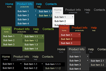
Drop-down menus are one of those “love ’em or hate ’em” elements in web design. Many designers or developers shy away from using them, and I used to be no exception to that. As I’m learning more about them though, I’m coming to embrace them – as long as they meet my “3 W’s” criteria.
As a designer, I have to stop and ask myself, why bother styling text links? It’s done so that it is plainly obvious what is a link and what isn’t. That way, the user doesn’t have to spend any additional time than is necessary trying to get to where they want to go on your Continue Reading »
Introductory text is often one of the first things that users skip when looking at content on a website. Even if that’s the case, you shouldn’t ignore it altogether when writing your content. It can have some important usability benefits, and it might get read more than you think.
Links are one of the most fundamental building blocks of successful content on your website, yet many people create them – knowingly or unknowingly – in ways that decrease their effectiveness. Here are some tips that you can use when writing links within your content that can help improve their overall usability.
I’ve used WordPress on four different websites that I’ve built this year, including this one. And the more I talk to people about WordPress, the more versed I am in why they should be using it on their website.
Although web designers don’t have to specialize in knowing all things SEO, it certainly can’t hurt if they know at least the basics. There are a lot of simple things that can be done when building a website for a client that will help increase the likelihood of the website having good search engine results.
To most people, where the sidebar navigation is on a website seem like something pretty insignificant. Chances are if you’re an average website user, it’s not something you give much thought to. But in the web design world, it’s something of greater interest, and it brings up some larger ideas about how people look at Continue Reading »
Usability is always a concern of web designers, but when it comes to web content writers, that’s not always the case. There’s no better example of this than the continued use of “click here” in link text. Here are 4 reasons why you should avoid using “click here” when writing the links in your content.
In the Brothers Grimm fairytale, Hansel and Gretel get lost in the woods, yet are able to find their way home because they left a trail of breadcrumbs on the path. Web designers use breadcrumbs for the same reasons – in fact, the fairy tale is where the term came from.