

From a web designer’s perspective, creating a better and more usable form usually means coming up with a nice, clean design. That’s definitely true, but it’s not 100% accurate, because how usable your form is also depends on how well you’ve written the instructions contained within it.
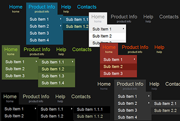
Drop-down menus are one of those “love ’em or hate ’em” elements in web design. Many designers or developers shy away from using them, and I used to be no exception to that. As I’m learning more about them though, I’m coming to embrace them – as long as they meet my “3 W’s” criteria.
Introductory text is often one of the first things that users skip when looking at content on a website. Even if that’s the case, you shouldn’t ignore it altogether when writing your content. It can have some important usability benefits, and it might get read more than you think.
As web content writers, we work hard on what we write and hope that people read every word of it. Unfortunately, it doesn’t happen that way. Most people tend to scan content on a website rather than read it, which is why it’s so important to use effective titles and sub-headers on your website.
Say a new visitor to your website finds you through a search engine. They’re impressed with your content, which was written to get their attention. They like your professional design, which establishes that you’re a trustworthy brand. So then what? Give them a call-to-action and tell them what they should do, that’s what!
Links are one of the most fundamental building blocks of successful content on your website, yet many people create them – knowingly or unknowingly – in ways that decrease their effectiveness. Here are some tips that you can use when writing links within your content that can help improve their overall usability.
We all know that different types of people use and read websites differently. Most of the time when you think of who the target audience is, the answers are in broad demographic categories: gender, age, people who have an interest in this particular topic, etc. Add to that category higher vs. lower literacy users.
Dark websites seem to be growing in popularity lately. If done properly, they can convey a sense of elegance, sophistication, sleekness, and/or professionalism. But in order to create a great dark website, web designers need to pay attention to some special usability concerns that come with the unique territory.
Launching a website can be a very exciting, yet frantic, time for both my clients and myself. With the end of the project in sight, it’s easy to forget to do some of the basic things that can greatly affect the initial success of the new website. Here is my list of what I do Continue Reading »
No page on your website is more important than your homepage, which is why it needs to make a strong first impression on your visitors. To make sure that happens, you need keep in mind some of the unique usability concerns when it comes to writing content for your website’s homepage.